Studio Work Index
Cecile Yang
S4121253
Assignment1
Introduction Exercise
Hi, my name is Cecile, I grew up in China and now studying at Melbourne.
I chose digital media as I'm interested in 3d modelling and UI design. I like using photoshop to edit pictures and draw.
I know a little bit about HTML and CSS.
Link to my GitHubIn-class experiment
Studio project speculation
Framing
My initial idea was to create a website based on something I am personally interested in and can enjoy. Although it may seem trivial, I found the brainstorming stage quite difficult—simply trying to define what counts as a “creative website” in a general sense felt almost impossible to me. So I shifted my approach and decided to start from a field I am passionate about, aiming to build a website that would also appeal to communities deeply engaged with fan-created content. The website is designed to generate derivative images. Users can upload images online, and the site will provide various filter tools, along with combinable elements such as stickers and frames. Based on the user’s preferences, the image can be processed and assembled into a final result. This result might be a newly composed image enhanced with cute stickers and frames, or even a new page resembling a “match success” screen from a chat application. In terms of functionality, the website needs to support image uploading, free selection of image areas, filter-based editing, and the ability to combine images with stickers and frames.
Purpose & Worth
The purpose of creating this website is to offer something engaging and useful for users who have original characters (OCs) or are fans of specific works. As we know, not everyone has the ability to draw, nor is everyone willing to use professional image-editing software to realize their ideas. While mobile editing apps are convenient, they are often filled with advertisements, and many appealing assets require paid subscriptions. These conditions highlight the advantages of this website: it is free (at least for now), browser-based, easy to access, ad-free, and efficient. Additionally, I am confident in my sense of online trends, so the assets provided on the site can match—or even exceed—the quality and trendiness of those found in typical editing apps. Based on its functionality, the website allows users with limited artistic skills, or those unwilling to use complex tools, to more easily obtain the images they want. In this context, “desired images” can also be understood as a form of emotional or imaginative fulfillment. While some may find this difficult to relate to, customizing images of favorite characters often leads to unexpected results and a strong sense of satisfaction. In terms of user experience, I hope users can encounter current popular elements on the website, such as meme-inspired stickers or comic-style panel frames, which would naturally appeal to highly active internet users. Since user-uploaded images may clash stylistically with the provided assets, I plan to use filters to unify the visual style and ensure better coherence in the final composition. In addition, I aim to enhance responsiveness and engagement through more dynamic and playful interface interactions, such as incorporating fun button sound effects, drag-and-drop functionality for arranging stickers, and creatively designed buttons. Overall, I hope users will perceive the website as trendy, slightly chaotic in a fun way, and fresh and engaging.
Assignment2
External links
Conceptual Response
At this stage, my project theme remains an “image editor.” The project is developed as a web-based application. Its visual design is inspired by Japanese fashion magazines from the 1990s, while its functional features draw from contemporary beauty editing applications. In simple terms, I aim to combine a retro Japanese magazine aesthetic with engaging, modern editing functions to create a unique image editing experience.
I plan to structure the interface to resemble a magazine cover layout. For example, buttons will be presented in different colours, and tilted typography will be used to mimic the small slogans or headlines commonly seen on magazine covers, while the central canvas represents the main featured image.
To achieve this, I need to consider both information design and mapping principles. Magazine covers are designed to be visually striking and often contain multiple focal points rather than a single clear hierarchy. However, directly replicating this style may lead to visual fatigue and make it difficult for users to navigate the core functions of the website effectively. Therefore, I aim to adjust these focal points by introducing a sense of hierarchy, while also using this hierarchy to guide user interaction. For example, the download button may be slightly smaller than the upload button to indicate its secondary priority.
In summary, I believe the key innovation of this project lies in how the visual language of 1990s Japanese magazines is expressed and reinterpreted. In addition, I also aim for the interaction experience to align with the visual style. For instance, I plan to incorporate neon-like glow effects into button interactions, as neon lighting is a well-recognised feature of Japanese urban environments. For interaction sound design, I am considering using sounds similar to the fizzing of beer, which evokes the atmosphere of izakaya culture. I also plan to include small animations inspired by 1990s Japanese variety shows after an image is downloaded, along with a “well done” voiceover delivered in the tone of a variety show host.
Technical Approach
The core features of this project include image uploading and downloading, real-time image editing, the application of filters, and the addition and editing of sticker elements. The project is primarily implemented using HTML, CSS, and JavaScript, and it incorporates Konva.js as its main framework. According to its official documentation, Konva.js is used for building interactive 2D graphics, and its capabilities include functions such as drag-and-drop image manipulation, cropping, and applying filters, which fully align with the requirements of this project.
Peer User Testing Reflection
In the testing phase, the questions I asked were quite specific, such as whether certain interface elements were large enough, or whether interactive sound effects should be added. One of the most interesting pieces of feedback I received came from a question about button placement. I asked users whether they preferred the button to be positioned at the top or the bottom of the interface, and the responses turned out to be evenly split.
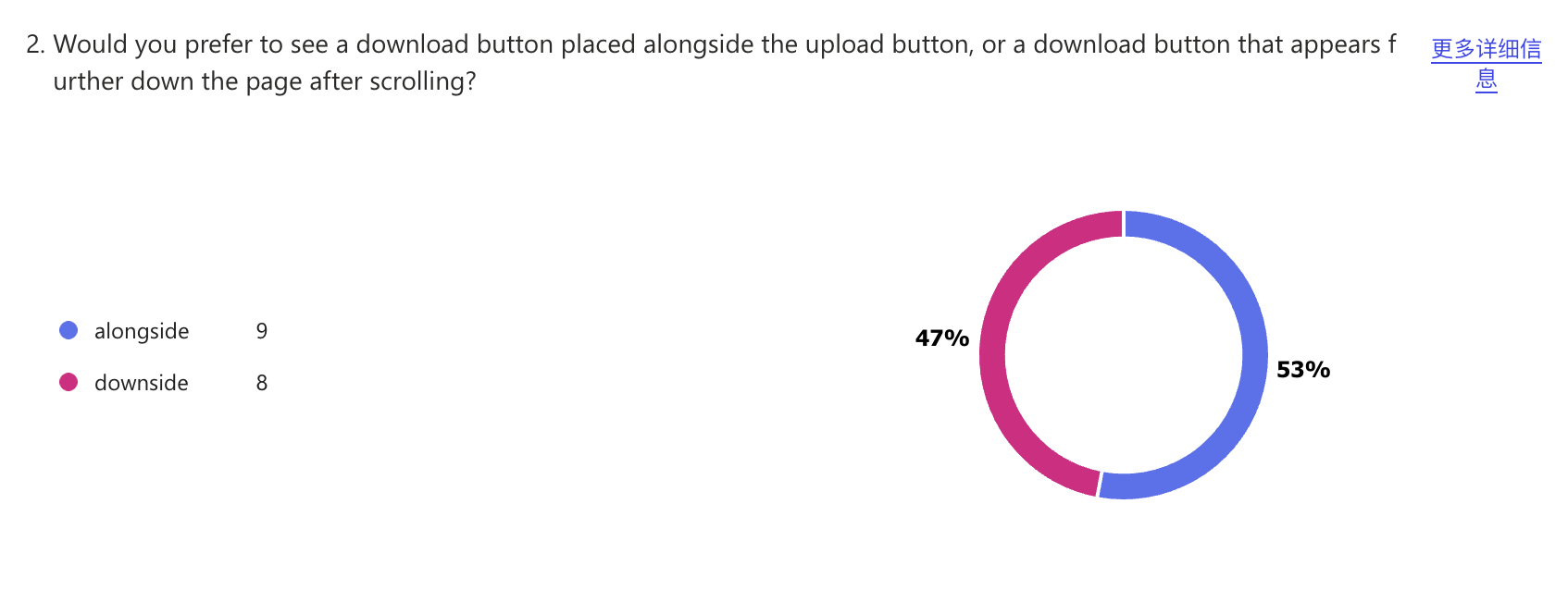
I think this suggests that such design decisions have a high degree of flexibility. Although different users may have different preferences, as long as it does not go beyond users’ intuitive expectations, the position of the buttons can be adjusted and optimised according to the visual requirements of the magazine-inspired style. Based on other questions and feedback, the main aspect that needs improvement at this stage is the size of the image editing area. In addition, more interesting and engaging interactive experiences should be added and enhanced.
Project Timeline
| Week | Task |
|---|---|
| Week 8 | Complete most of the core features |
| Week 9 | Do layout design & interaction |
| Week 10 | Continue development and testing |
| Week 11 | Final testing |
Assignmnet3
Image Editor
Click hereAssignment4 - Design Reflection
Purpose
At the beginning of this project, I wanted the website to provide some basic online image editing functions while also offering users a visually distinctive and enjoyable experience.
In the final design, the website includes functions such as image uploading and downloading, adding stickers in different styles, applying three filters, adjusting brightness and contrast, deleting selected objects, undoing actions, and clearing the canvas. Visually, the website presents a layout that appears chaotic at first glance but remains organised underneath. Inspired by magazine cover layouts and editorial columns, the interface integrates functional buttons into the overall composition. The colour palette is primarily pink, with a small number of contrasting colours used to reinforce the original concept of a 1990s Japanese fashion magazine. Despite this, there are still many limitations and areas for improvement. I spent most of my time on layout and visual design, while giving less attention to interaction design. Through the project, I began to realise that my understanding of “innovative interaction” might have been somewhat narrow.
As reflected in the feedback I received after my presentation, I could have integrated the functionality more closely with the design concept itself. For example, instead of using three generic filters, I could redesign them around the idea of “creating your own 90s Japanese magazine-style image.” Different filter combinations could simulate old magazine printing effects, idol poster aesthetics, or Harajuku-inspired visuals through customised parameter adjustments. In this way, the functions themselves would become part of the theme rather than simply existing alongside it.
Values
From the beginning, I prioritised visual design over interactive functionality. During the brainstorming stage, I found it very easy to describe the visual styles I liked, but much harder to come up with interaction ideas that genuinely interested me. Driven by that preference, I decided to begin with the visual direction, even though I knew it was not the most rational approach.
My biggest expectation for the website was that it would be visually attractive—or, more simply, that it would look good. Regardless of how limited the functionality might be, I wanted it to have a distinctive visual identity. Ideally, I wanted users to enjoy spending time with it and perhaps even think, “The person who made this website has good taste.”
In the final design, I incorporated as many forms of guidance as possible, including animated arrows, prompts explaining where to begin editing, and instructions for brightness and contrast adjustments. These animated elements proved to be some of the most effective forms of guidance. I strongly believe that guidance is necessary in any form because a relaxed and enjoyable experience first requires removing barriers to understanding. In the same way that it is difficult to enjoy learning without understanding the lesson, it is difficult to enjoy a tool that is confusing to use.
I also tried to make most of the guidance visually appealing by integrating it into the layout and using typography and colour to establish hierarchy. At the same time, I added a large number of decorative elements to create a mood similar to browsing through a magazine. Based on the feedback I received, this approach was successful in leaving users with a strong impression of the website’s visual identity.
Interaction design principles
Traditional image editors usually organise menus and functional buttons through clear hierarchies. Their interfaces tend to be orderly, consistent, and minimalist. As functionality increases, the number of controls also increases, raising the learning curve. Photoshop is perhaps the most obvious example. When these characteristics are transferred to a web-based environment, large numbers of visually similar buttons can easily distract users and create confusion.
In terms of Mapping, I chose to retain sliders for brightness and contrast because they are the most familiar and intuitive method for users. However, I integrated the sliders into magazine-style labels so that they would appear more like part of the visual design rather than isolated interface components. I applied a similar approach to the filter buttons and sticker selection bar. Since these elements are represented as buttons rather than sliders, I designed them to resemble magazine labels, emphasising the everyday and playful qualities associated with magazines. As a result, the boundary between controls and the editing area becomes less pronounced, allowing the interface elements to blend more naturally into the overall aesthetic.
In terms of Information Design, traditional image editors typically prioritise functionality, encouraging users to recognise the software as a tool first and foremost. I wanted users to experience the visual atmosphere of a 1990s Japanese magazine before gradually discovering the image editing functions. For this reason, my focus was not on maximising functional density, but on establishing a clear visual hierarchy that would guide users through the title, canvas, and functional areas in a way that feels closer to reading a magazine.
Unlike conventional image editors that prioritise efficiency and functionality, I wanted information design itself to become part of the creative experience. Beyond helping users understand the structure of the website, elements such as colour, typography, decoration, and layout also communicate the visual identity of the project. My goal was for users not only to understand where each function was located, but also to gradually absorb the visual atmosphere of a 1990s Japanese magazine while navigating the interface.
Design judgement
During the early stages of the project, I primarily planned the interface from a visual perspective. My goal was to reinforce the characteristics of 1990s Japanese magazines through magazine-inspired layouts. However, as more functions were introduced, I realised that this approach was beginning to affect usability.
In one version of the design, I followed the layout conventions of vertically structured magazines and placed several key functional buttons close to the title area. After introducing the canvas into this layout, I realised that although it successfully recreated the magazine aesthetic, it also introduced a significant usability issue. While scrolling can be an effective browsing method for websites, the editing canvas and editing controls ultimately need to appear on screen at the same time. This is one of the most basic requirements of user-friendly design.
I realised that maintaining the magazine-inspired layout strengthened the visual identity of the website but reduced its usability. As a result, I decided to prioritise keeping both the editing area and the main controls within the user’s field of view. I significantly rearranged the canvas and controls, retaining only the upload function near the title area and adding an automatic jump-to-canvas feature after uploading. I also reduced the size of the canvas and placed control panels on both sides. This allowed users to view the canvas and the primary editing tools simultaneously without scrolling.
After recognising the importance of usability, I experimented with another layout in which all controls were organised neatly on the left side of the screen while the canvas occupied most of the right side. This arrangement is common among image editing tools and was much more straightforward to use. However, it also felt completely disconnected from the visual identity of the website. The orderly structure removed much of the spontaneity and freedom associated with magazine design.
After comparing these alternatives, I concluded that visual style and functionality do not need to exist in opposition to one another. Rather than fully prioritising one over the other, the more important task is to establish a clear information hierarchy that allows users to complete tasks efficiently while still experiencing the visual qualities of the magazine-inspired design.
Production timeline
During the first stage of development, the functionality of the project was very limited because I struggled to establish a clear theme and direction. To avoid becoming stuck, I decided to build the basic technical framework first, including the canvas and image upload system, while gradually searching for a stronger visual direction. I stopped trying to define “innovation” in the abstract and instead focused on something I already enjoyed and understood: image editing.
One of the features I frequently use in image editing software is Japanese magazine-style stickers. Inspired by this, I quickly established the visual theme during the second stage of development, created background sketches, and began integrating the interface elements and functionality.
During the third stage, I expanded the initially simple functionality while continuously refining the relationship between visual style and usability. Much of this phase was spent iterating on layouts, controls, and interactions in order to improve the user experience without compromising the visual identity.
Through this project, I realised that the longest and most important part of the design process is often iteration rather than production itself. The more planning that can be completed in advance, and the more time reserved for testing and refinement, the greater the potential of the final outcome.
Most proud of
The aspect I am most proud of is how successfully the website communicates its visual identity. Based on the feedback I received, the project was successful in capturing the atmosphere of a 1990s Japanese magazine. The oversized title, playful decorative symbols, magazine-style stickers and tape graphics, geometric background compositions, and carefully selected colour palette all contribute to a highly recognisable visual identity. Even without explanatory text, users can often identify the overall inspiration behind the design. This makes me feel that my efforts in visual expression were worthwhile.
More importantly, the project deepened my understanding of branding and visual identity systems. In the past, I focused primarily on whether individual elements looked good on their own. Through this project, however, I realised that style does not depend on any single component. Instead, it emerges through the consistency of all visual elements working together. The title, buttons, decorative graphics, stickers, and colours all need to support the same visual language. Over time, I came to see that branding follows a similar logic. It is not necessarily about creating something entirely new, but about reinforcing and repeating a visual language until it becomes immediately recognisable. In that sense, this project helped me better understand how visual design communicates identity and personality.
Challenges
Throughout the project, the question that troubled me most was: “Is this creative enough?” Image editing tools are everywhere. Could an image editor really be considered innovative? If not, where should I even begin? During the early stages of the project, I spent a great deal of time searching for a sufficiently original idea, but struggled to find a clear direction. I often felt that creativity was one of my weaknesses and even developed a tendency to avoid starting because I believed I needed a particularly unique idea before I could begin.
It was only near the end of the project that I realised my understanding of innovation had been too narrow. I had assumed that innovation meant inventing a completely new function. Later, however, I came to understand that reorganising and reinterpreting familiar ideas can also be innovative. My website does not introduce new image editing functions, but it places familiar editing tools within the visual context of a 1990s Japanese magazine. Innovation does not necessarily have to come from functionality itself; it can also emerge from the way a designer chooses to frame a project and the meaning they decide to give it.
Another ongoing challenge was balancing visual aesthetics and usability. Overemphasising visual style can reduce usability, while prioritising functionality too heavily can weaken the project’s identity. This tension remained present throughout the project and became one of the main reasons for repeated iterations. Ultimately, I realised that finding this balance is not like solving a mathematical equation with a single correct answer. Instead, designers must continuously test, compare, and adjust their work in order to move closer to the solution that best suits the project.
Peer comparison
One of my classmates’ creative tools left a particularly strong impression on me. Unlike my own approach, their design was based on a minimalist philosophy. The website was almost entirely white, contained only a small number of essential buttons, and included very little visual decoration or guidance.
Initially, I assumed that this lack of information might create confusion. However, after using the tool myself, I realised that because the functionality was intentionally limited, users could understand the entire system through exploration alone, even without instructions. This made me realise that information design does not always require the addition of visual cues. In some cases, reducing the number of interface elements can itself become an effective way of organising information.
This project provided a strong contrast to my own design decisions. In my work, I relied on visual style, layout, and guidance elements to help users understand the interface while creating a distinctive atmosphere. My classmate, on the other hand, reduced complexity by simplifying the interface as much as possible. Although the results were completely different, both approaches attempted to solve the same problem: helping users understand and use a tool quickly.
Ultimately, I realised that information design does not have a single correct solution. It exists to serve a design concept, and different designers will naturally arrive at different answers.